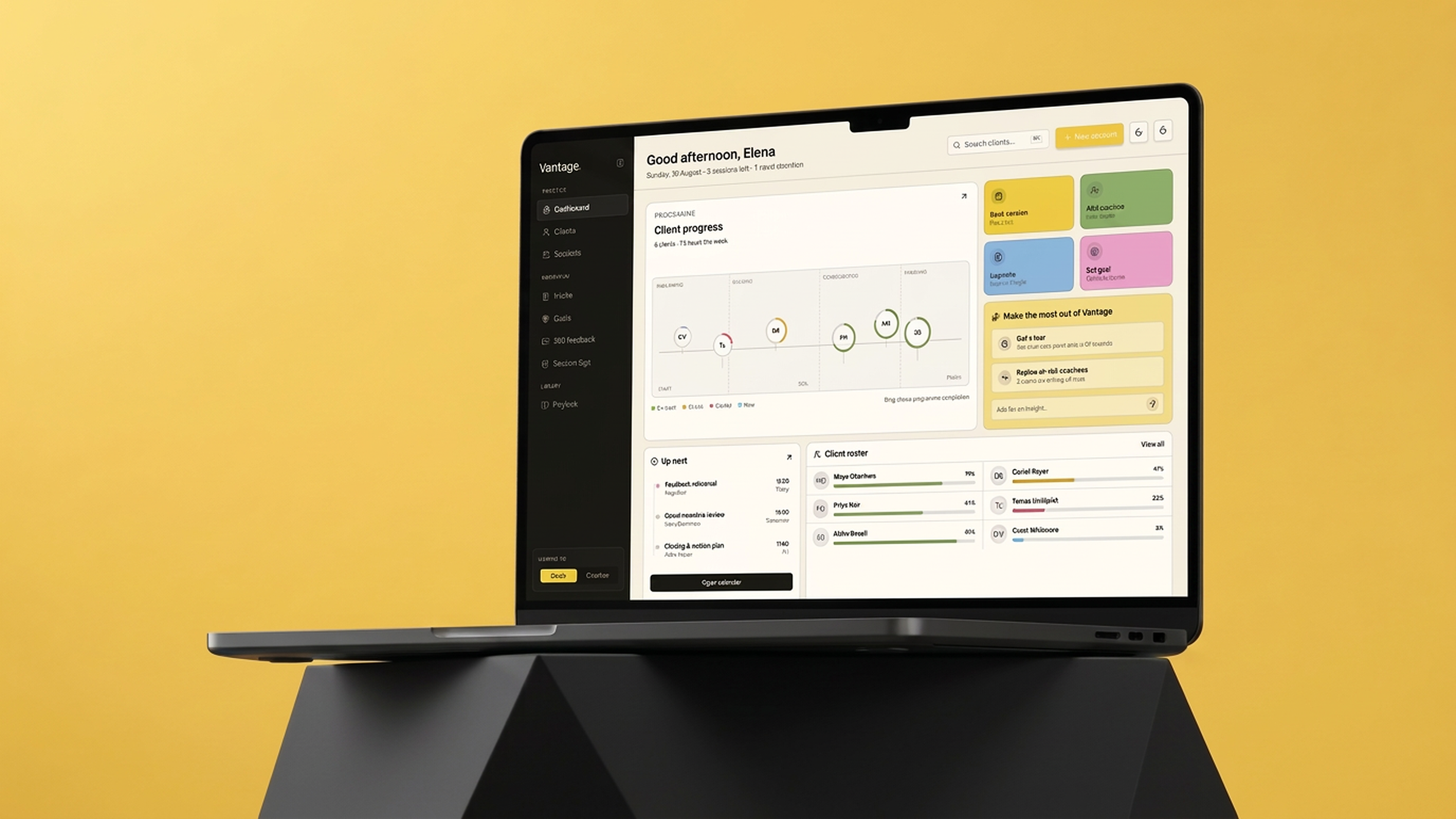
An AI-powered coaching platform that gives executive coaches a complete lifecycle tool and gives the organizations funding those coaches a meaningful view of progress, without ever compromising what stays private.
Background
Fragmented work makes connection difficult
Executive coaches manage complex, high-stakes engagements across multiple clients yet most rely on disconnected notes, generic CRMs, and improvised spreadsheets. Organizations invest in coaching programs without meaningful visibility into outcomes. A coach can have notes in one app, scheduling in another and feedback in a spreadsheet. The administrative cost matters, but the larger risk is losing the thread between sessions: who is moving, who is drifting, and what needs attention now?
Vantage was designed to solve both sides of this at once. For the coachee, it creates a single, intelligent space where sessions, reflections, goals, and actions live together and where an AI layer can surface patterns, connections, and questions that a human coach might miss between meetings. For the sponsor, the organization or manager investing in the program, it provides a meaningful view of engagement and growth without ever compromising what the coachee shares in their private space.
Research
“The dashboard should answer what needs my attention before it asks me to do anything.”
01
Progress is trapped in prose. Percentages and notes do not reveal cohort shape or outliers at a glance.I spoke with executives who had been through coaching programs and with program coordinators who managed them.
02
Workflow context is scattered. Intake, sessions, feedback and follow-up feel like separate products.
03
Coachees lack a shared view. Momentum becomes something the coach tracks, rather than something both people can see.
The Core
Success Criteria
Read overall practice health in seconds.
Existing tools cover parts of the journey like scheduling, invoicing, notes but none cover the full engagement arc from sponsor briefing to closure report.
Move from signal to action in one click.
Coaches do all the synthesis themselves, reading data, identifying patterns, writing debrief narratives. This is exactly where AI insights add value.
Style Guide
Color Palette, Base
Paper
#F8F3E6
App background
Ink
#171611
Text / sidebar
Panel
#FEFCF6
Cards / popovers
Warm Grey
#625D52
Muted text
Color Palette, Accents
Lemon
#F5D240
Primary accent
Leaf
#91B265
On track
Ember
#E0A61E
At risk
Rose
#E85760
Stalled
Sky
#8CBDE8
New / info
Pink
#F0ADD0
Secondary surface
Violet
#C282BC
Reflection tags
Dark Mode
Night
#1E2229
Background
Warm Light
#F3E9D6
Text
Deep Lemon
#F2B721
Accent
Ink Raise
#282621
Active nav
Typography
Sora carries display type, figures and the wordmark. Manrope carries every functional piece of the interface.
DisplaySora, 38px, 600
Good afternoon, Elena
Section TitleManrope, 16px, 600
Client progress
BodyManrope, 14px, 400
Six coachees are mid programme. Two need attention before Friday, and one has not logged a reflection in three weeks.
Caption / LabelManrope, 12px, 700, uppercase
Up next
Small MutedManrope, 12.5px, 400
Last session 4 days ago
Surfaces and Navigation
Card on paper
Active clients
12
Sidebar
Vantage.
Dashboard
Clients
Sessions
Playbook
Components
On trackAt riskStalledNew
Tokens
Token
Value
Use
--background
#F8F3E6
App background
--foreground
#171611
Primary text, sidebar
--card
#FEFCF6
Panels and popovers
--muted-foreground
#625D52
Secondary text
--accent / --lemon
#F5D240
Primary accent
--leaf / --ember / --rose / --sky
#91B265 #E0A61E #E85760 #8CBDE8
Status encoding
--border
rgba(23,22,17,.17)
Hairlines and outlines
--radius
8px
Base corner radius
--font-serif
Sora
Wordmark, headings, figures
--font-sans
Manrope
All interface text
Final Design
Designing the operating surface.
Early designs surfaced AI suggestions inline during a session. Testing showed this felt intrusive and coaches didn't want an AI interrupting. I moved the AI layer to a separate post-session mode, activated by choice. This meant giving up the more impressive demo to build the more useful thing.
The information boundary between the coachee and sponsor surfaces is the other core design decision and it's not a privacy feature pasted on. It's the organizing principle the whole product is built around. Sponsors see position in the journey. They never see session content. That boundary is what makes both sides trust the system.
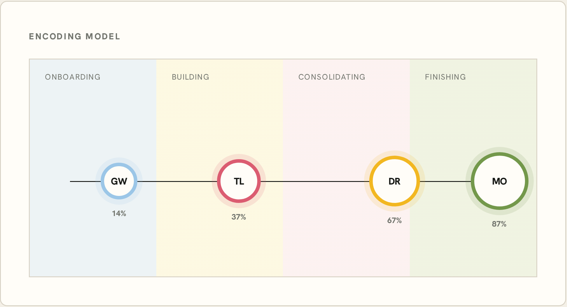
A progress map with a point of view.
A standard roster makes every client look equivalent. The bubble map makes position, momentum and risk visible together while staying actionable.