Have you ever heard the phrase, 'travel like a local’? What does it mean to be a traveler and not a tourist? Travelling like a local seems like the goal for any traveller, but how many of us have ever actually interacted with these locals whose ways of exploration we so covet? Scouring the internet to find interesting places is often a task with each piece of information on a different website
Background
What does it mean to travel like a local?
ProTrip started from a simple frustration: the phrase "travel like a local" is everywhere, but no tool actually helps you do it.
Existing travel apps are built around search and proximity where you type a city, you get a ranked list of the same attractions everyone else is seeing. The experience is efficient but not personal, and it gives you no way to tell the app that what you actually care about is mid-century architecture, or regional textile traditions, or a particular kind of cooking class.
I designed the end-to-end mobile experience for a system that flips this model. Instead of showing you everything and letting you filter, ProTrip starts by understanding what you care about and builds every recommendation around those specific interests. It also introduces a direct path to locals: verified guides and hosts who offer experiences that no algorithm could surface on its own.
Research
Most travel apps were built for tourists not travellers.
I began by interviewing 12 people who travel regularly, from weekend city-hoppers to longer-term explorers, with a focus on how they currently plan and experience trips, and where that process breaks down.
I also conducted competitive research across major travel platforms to understand the structural limitations of what already exists.What I found was consistent. They assume you want to visit the most popular places, in the most efficient order, with maximum information density. They don't ask what you're interested in. They don't connect you to anyone who actually lives there. And they require you to stitch together your own experience across multiple apps, websites, and tabs before you've even arrived.
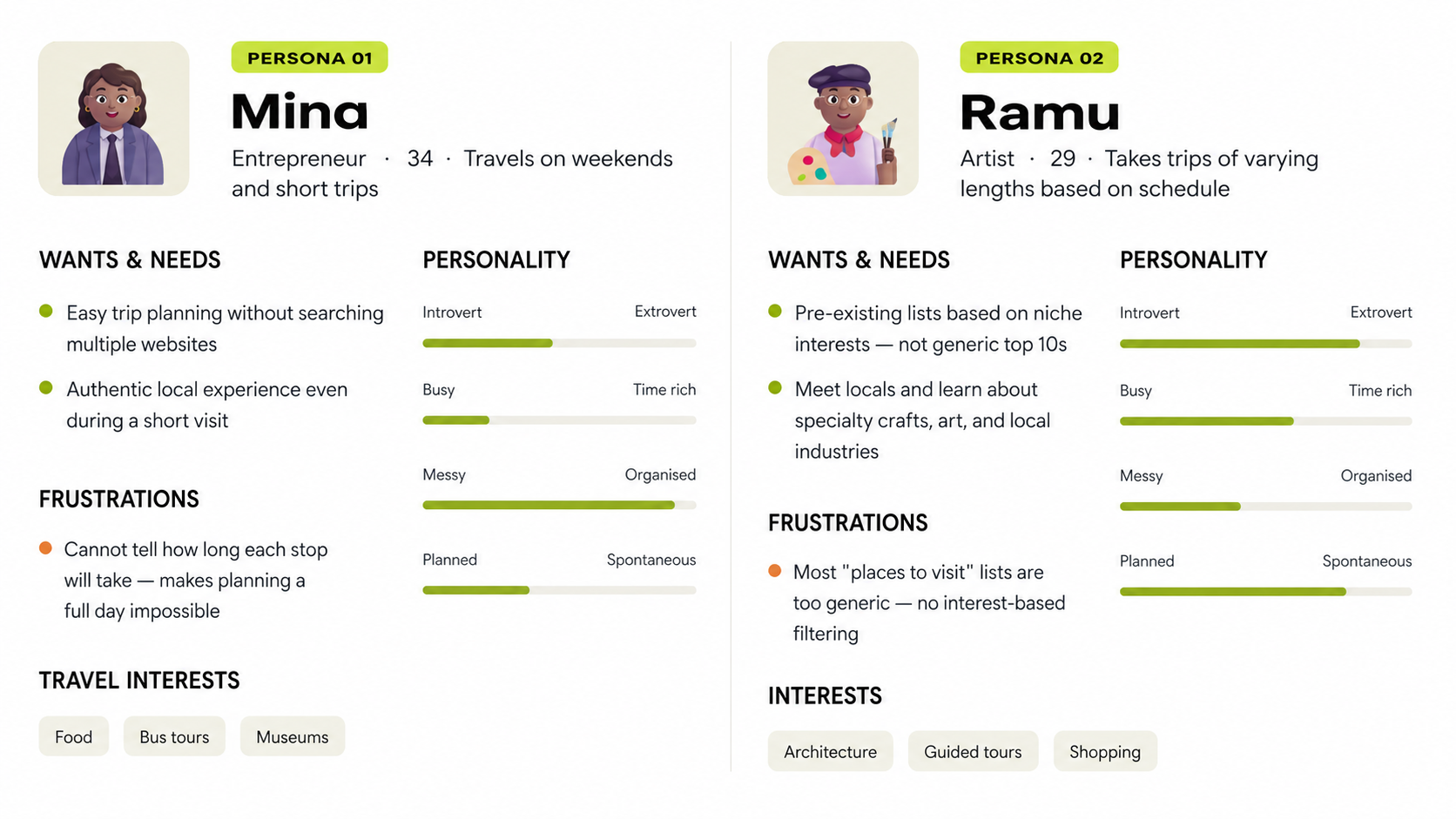
Interviews revealed two distinct user archetypes not just in travel style but in how they approach time, planning, and discovery. Both are underserved by existing travel apps.
Core Problem
How might we create an experience that surfaces what a city has to offer based on who the traveller actually is?
The interviews identified three pain points that appeared consistently across both user types and across every travel style represented in the research. These weren't edge cases but were structural failures of the current model.
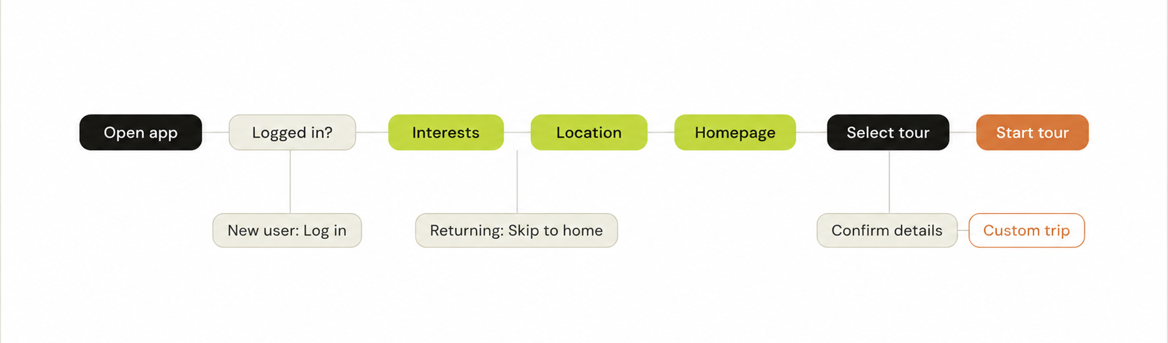
The most consequential architectural decision was where to place interest selection in the user flow. An early draft put it in the account settings, something you could configure later. User feedback from the first iteration made clear this was wrong. If the first thing you see is a generic list of popular tours, you've already been primed to engage with the app as a tourism tool rather than a personal discovery system.
Moving interest selection to before the home screen as the last step of onboarding, before anything else loads means that every recommendation a user sees on day one is already filtered around who they are.
Style Guide
Color Palette
Light Grey
#F0F0F0
Background
Lime
#C4DF00
Primary
Tangerine
#E87830
Accent
Ink
#181818
Text
Typography
Heading 1 · Syne · 48px · BoldInteract
Heading 2 · Syne · 32px · RegularWhat are you into?
Subtitle · DM Sans · 16px · RegularSelect at least 3
Small Title · DM Sans · 16px · BoldLocal Delicacies of Kochi - Cooking Class
Caption · DM Sans · 16px · ItalicDuration: 1 hour
Body · DM Sans · 14px · RegularExplore local experiences, hidden gems, and cultural activities curated just for you based on your interests and travel style.
The most useful thing that happened during research wasn't a specific insight but noticing that Mina and Ramu had almost nothing in common as travellers, and yet they were both frustrated by exactly the same structural problem: that travel apps don't ask who you are. That observation is what drove the decision to make interest selection the first thing a new user does, rather than a setting they might configure later. If you don't collect that signal early, everything downstream is generic, and generic is exactly what people are trying to escape when they download a travel app.The most consequential architectural decision was where to place interest selection in the user flow.
1. Onboarding
The interest selection helps structure the homepage for every user.
2. Tour Details
This screen is where Mina's core frustration was addressed.
The stop list uses a simple timeline with lime green for the current or first stop and muted dots for subsequent ones, borrowing from navigation interfaces that users already understand.
3. Local Experiences
Local Classes are the most distinctive content type in the app and needed to feel that way.