Translating a physical experience into a digital application
Year Role Tools
2024 Designer Figma
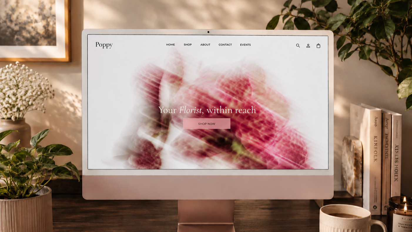
A consumer marketplace app and web platform designed to translate the personal, sensory experience of buying flowers from a local florist into a digital interface that feels just as considered and human.
Background
What a good florist does
There is a specific kind of experience you have in a good flower shop. The florist looks at you and asks what you're celebrating, or suggests something based on a scent they think you'll like, or wraps something in a way that makes it feel like it was made specifically for you. It is guided, tactile, and personal in a way that very few commercial transactions are. Almost every existing flower and plant ordering app eliminates this entirely.
Poppy is a design attempt to get some of that back. Not to simulate the florist, but to bring the same level of consideration about fragrance, care, visual personality, occasion into a digital product that most people are shopping on between other tasks. The challenge was not to make something beautiful, but to make something useful in the same way that a knowledgeable person is useful: it helps you make a decision you actually feel good about.
Research
Buying flowers online feels nothing like buying them in person.
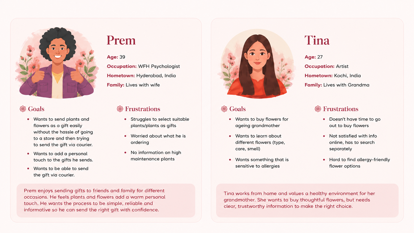
I started with eight user interviews focused on how people currently buy flowers and plants online, what they find difficult, and what they wish the experience offered. I combined these with competitive research across five major platforms to understand structural patterns not just in what features they have, but in what assumptions they're built on.
The top priorities that emerged: easy category navigation, rich product details (care tips, fragrance notes, size guidance), and the ability to personalize or gift an order without friction.
"The online experience of buying flowers can be overwhelming simply because of the images and amount of colours on a single page. It becomes visually too much and makes decision making difficult."
— User interview participant
Core Problem
How might we translate a sensory, florist-guided experience into a digital product without losing what makes it human?
The interviews identified three pain points that appeared in every conversation, regardless of how frequently or casually someone bought flowers. These weren't preferences or nice-to-haves, they were the things that were actively causing people to abandon the experience or avoid it entirely.There is a specific kind of experience you have in a good flower shop. The florist looks at you and asks what you're celebrating, or suggests something based on a scent they think you'll like, or wraps something in a way that makes it feel like it was made specifically for you. It is guided, tactile, and personal in a way that very few commercial transactions are. Almost every existing flower and plant ordering app eliminates this entirely.
Poppy is a design attempt to get some of that back. Not to simulate the florist, but to bring the same level of consideration about fragrance, care, visual personality, occasion into a digital product that most people are shopping on between other tasks. The challenge was not to make something beautiful, but to make something useful in the same way that a knowledgeable person is useful: it helps you make a decision you actually feel good about.
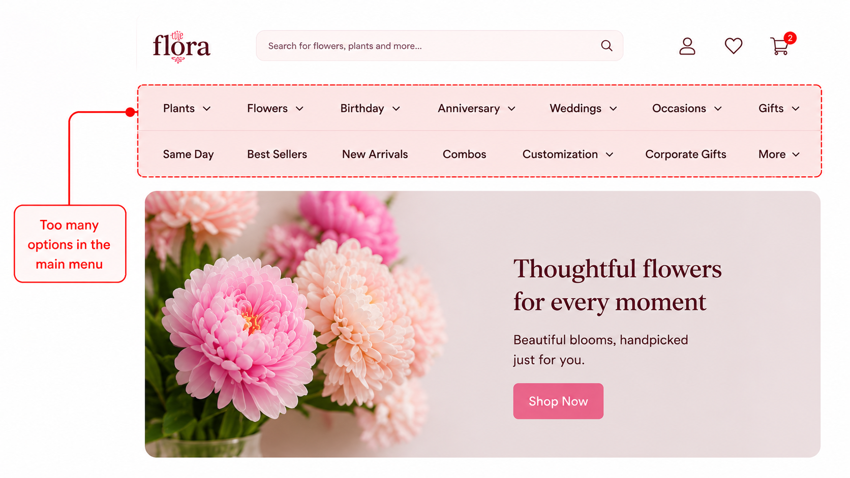
1. Overwhelming navigation Dense product grids with competing colours, inconsistent photography, and no filtering by what actually matters to users (scent, care level, occasion) created what multiple participants described as "decision paralysis."
The abundance of choice, presented without guidance, made choosing harder rather than easier which is the opposite of what a good florist does.Too many options with no clear hierarchy left users unsure where to start.
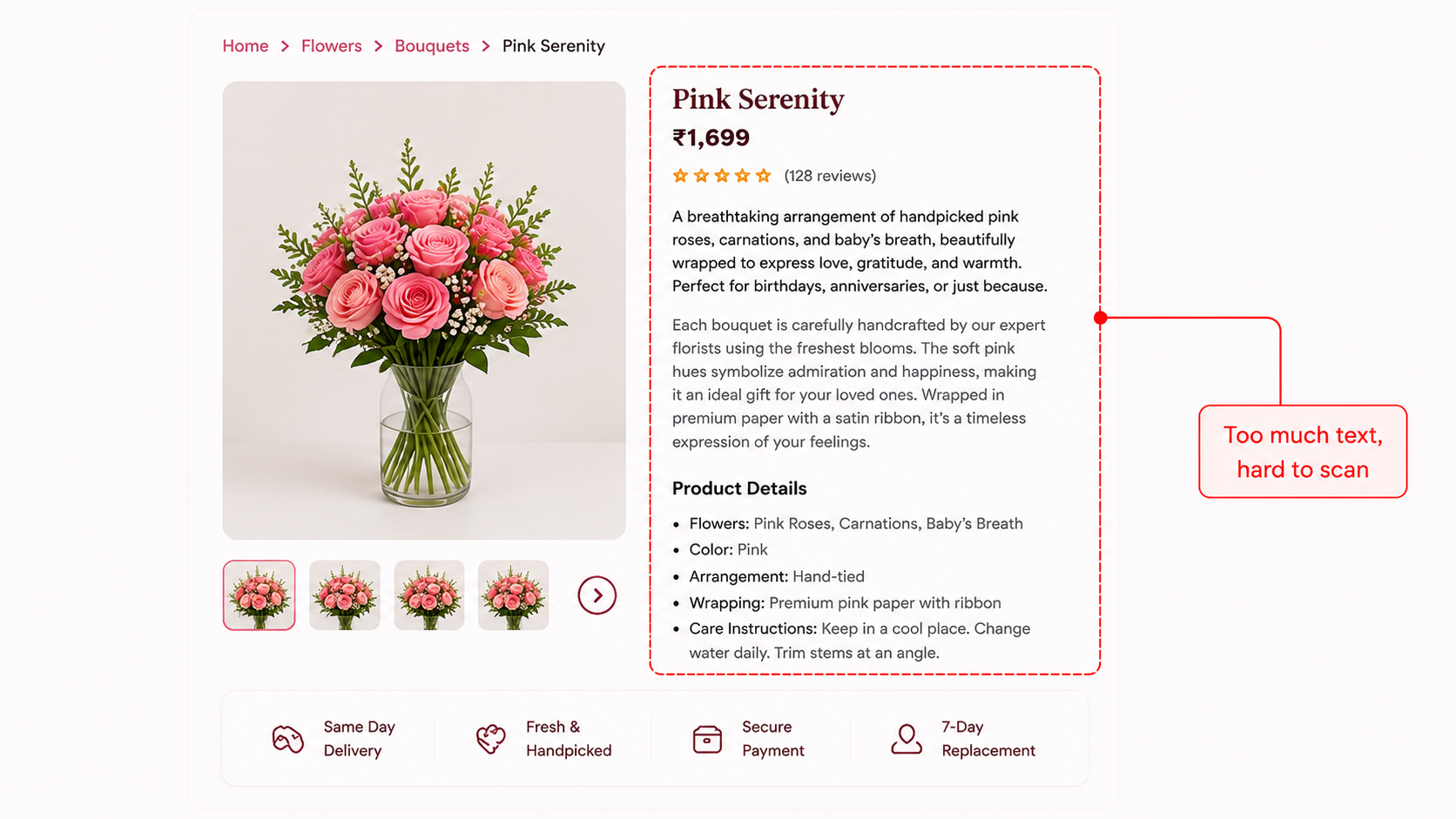
2. Information that conveyed nothing Existing product pages showed too much text for a user to scan through when making decisions. The digital experience assumed users already knew what they were buying which is precisely what a florist in person never assumes.
3. The gift experience feels transactional rather than personal Without texture, scent, or a florist's guidance, users couldn't confidently make a choice online.
Several participants said they specifically avoided ordering flowers as gifts online because the experience "didn't feel right for it." The gift flow in most apps is an afterthought, a checkbox and a text field buried in checkout. Nothing about it felt like an act of care, which is what sending flowers is supposed to be.
Style Guide
Calm, warm, and sensory
The visual language was designed to replicate the feeling of a warm, and natural boutique florist. Every choice was made to ensure that users could spend time browsing without feeling overwhelmed.
Color Palette
Cream
#FFFDF8
Background
Sage
#A9C46C
Primary
Blush
#F2C6CF
Accent
Charcoal
#494949
Text
Typography
Heading 1 · 32px · 600Pink Tulips
Heading 2 · 24px · 600$10.00/Piece
Subtitle · 16px · 500Add to Cart
Body · 14px · 400A handcrafted seasonal arrangement featuring garden roses, eucalyptus, and ranunculus in soft blush and ivory tones.
Final Design
Each screen below addresses one of the three core pain points identified in research, with the design decision explained alongside the screen.
1. Clear Information Presented
This screen is where one of the pain points is addressed directly. The care notes, allergy information, fragrance profile and other flower specific information is presented in a way that can be scanned through quickly. In a flower shop, a good florist volunteers this information unprompted
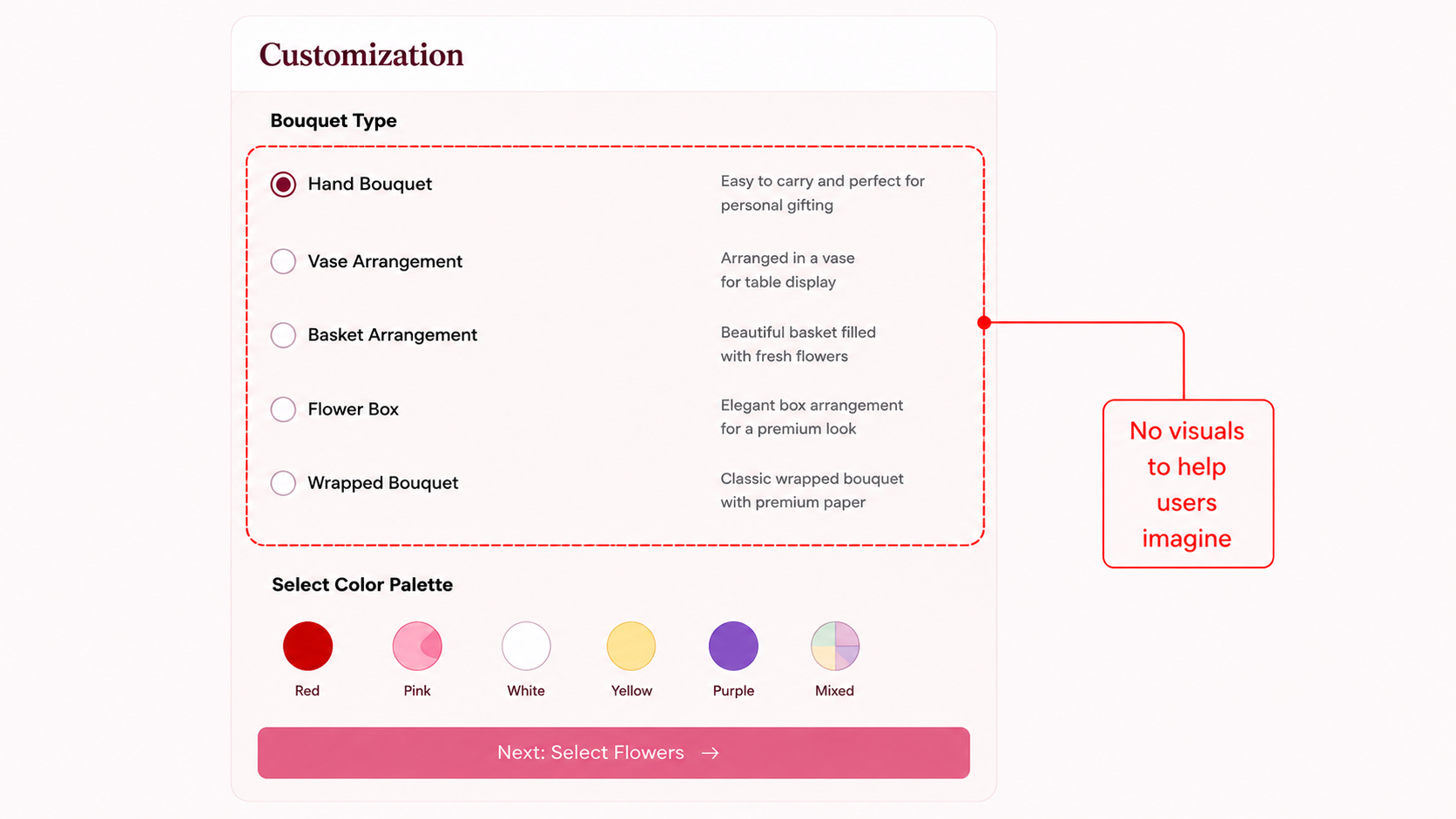
2. Visual Guide to Customization
Without texture, scent, or a florist's guidance, users couldn't confidently make a choice online.
Several participants said they specifically avoided ordering flowers as gifts online because the experience "didn't feel right for it." The gift flow in most apps is an afterthought, a checkbox and a text field buried in checkout. Nothing about it felt like an act of care, which is what sending flowers is supposed to be.
3. Equivalent App Design
The same design was optimized for a mobile screen.
.png)