.png)
The Goal
People don’t always have the time to go to a plant nursery, pick out plants or flowers. Existing online stores are often difficult to navigate making it a confusing and frustrating experience. Buying plants and flowers is often a visual experience in real life and that needs to be translated in the app.
This project's goal is to translate the plant buying experience into a digital space, allowing users to easily place orders for flowers through an app, customize their order, view the order before it leaves for delivery and even be able to send them as meaningful gifts to loved ones.
This project's goal is to translate the plant buying experience into a digital space, allowing users to easily place orders for flowers through an app, customize their order, view the order before it leaves for delivery and even be able to send them as meaningful gifts to loved ones.
The Users
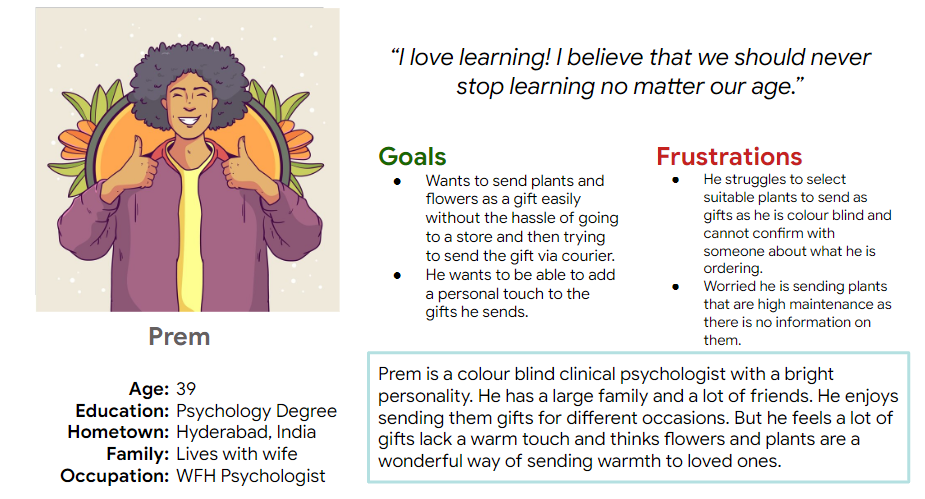
I conducted user interviews and created empathy maps to better understand the user’s needs. I identified the primary target group to be busy adults, who don’t have the time to go to a plant nursery to buy the plants and flowers they want.In my initial secondary research, I found the top need of users to be that they would want to be able to navigate an app with plants and flowers being easy to find through simple set of categories. In my primary research, I deduced that the topmost priority should be given to details such as care information, fragrance notes of flowers and other tips. Buying plants and flowers is a visual and olfactory experience that is often guided by a florist in a shop. There is a need to translate this into the digital space.

Issues Highlighted by Users & Competitive Analysis
Users mentioned: 'The online experience of buying flowers and plants can be overwhelming simply because of the images and amount of colours present on a single page. It becomes visually too much and makes decision making difficult.'
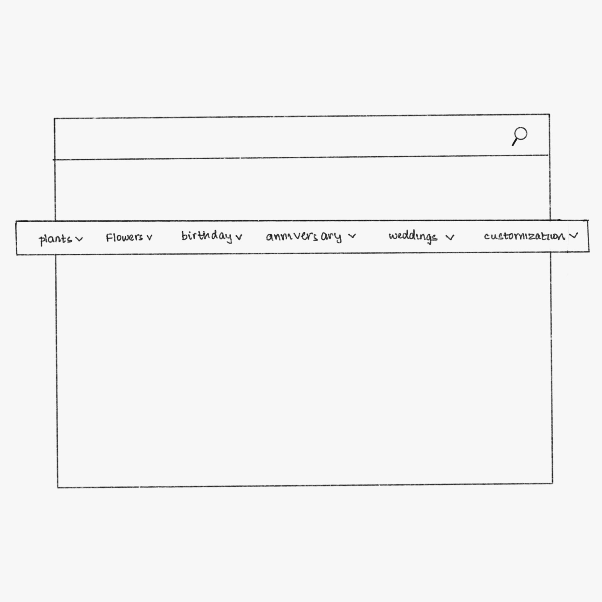
Overwhelming Navigation
Too Much Information Conveying Little
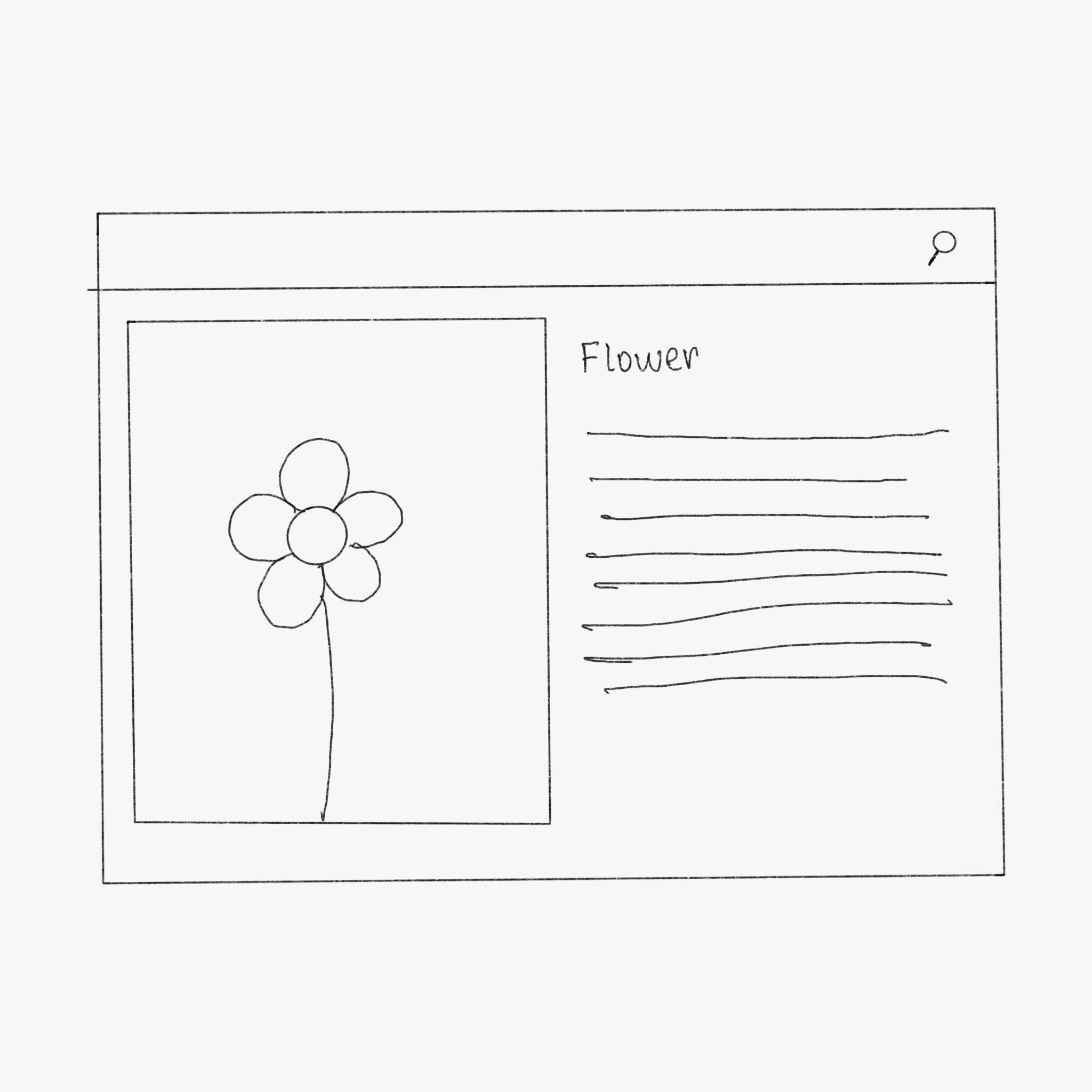
Lack of Visual Representation

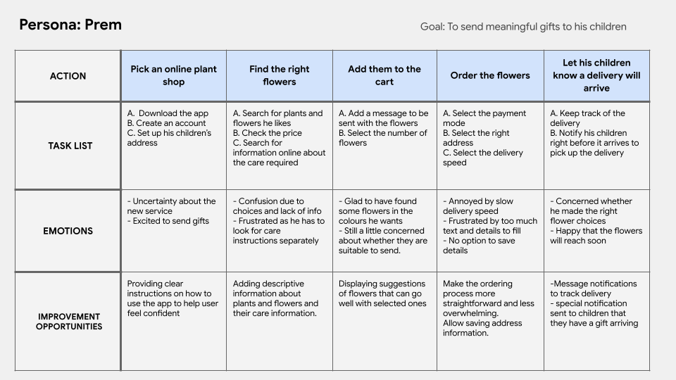
User Journey Map
As the first step in my process I made storyboards to illustrate the ideal user experience and establish the 'why'.
Site Map
Made with a focus on simplifying navigation without overwhelming visuals.
.png)
Wireframes
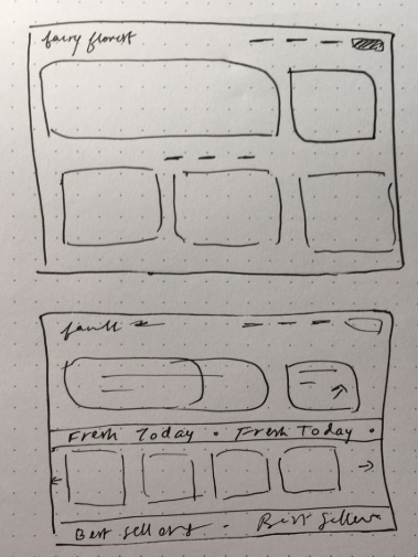
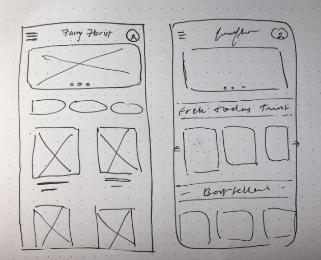
Visual Language
Focusing on clean and consistent colors and fonts with spacing that makes it visually appealing allowing users to spend time on the application without feeling overwhelmed.
.png)
Mockups
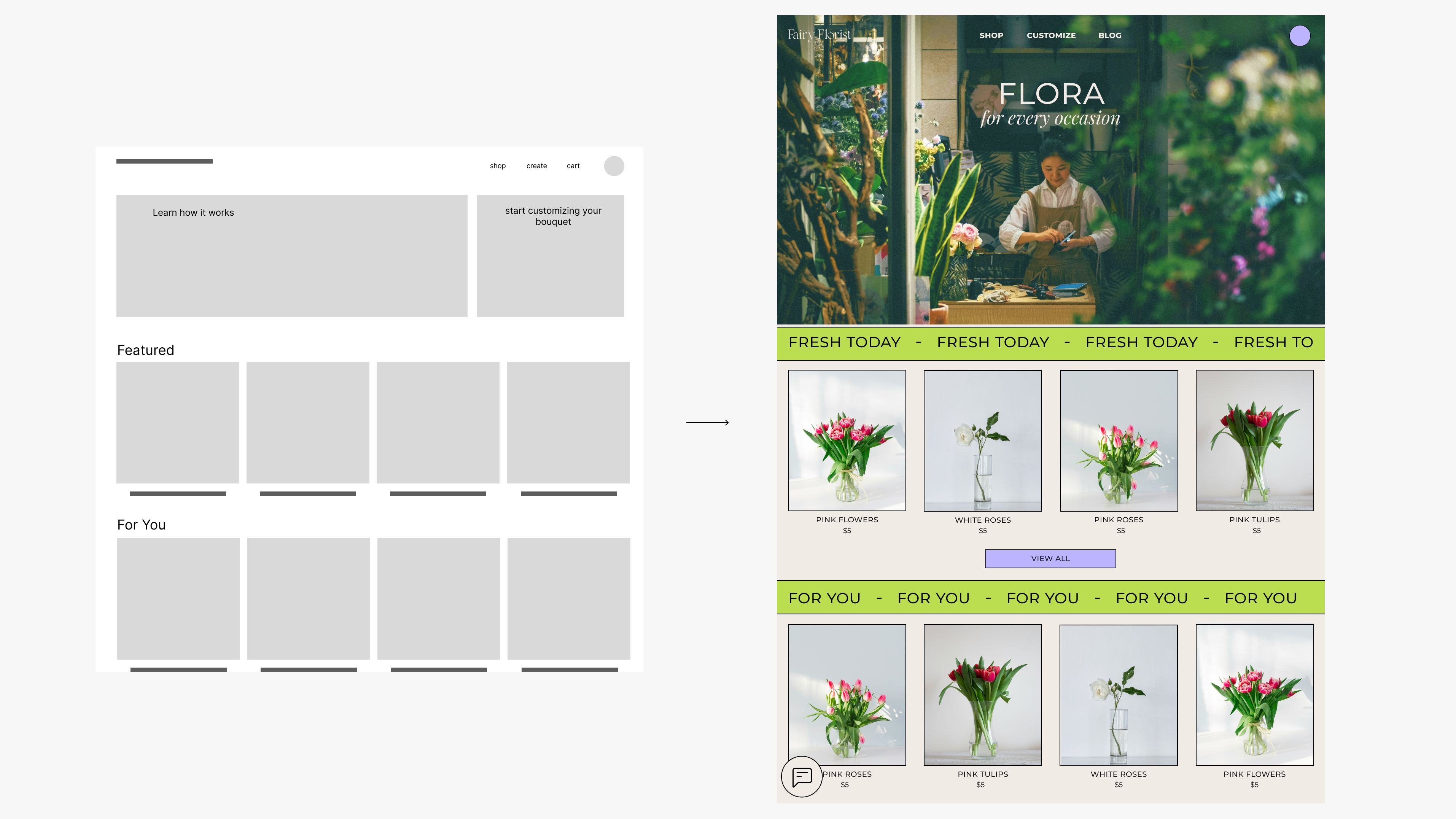
.png)
Easy Visualization
Clear Information Presented
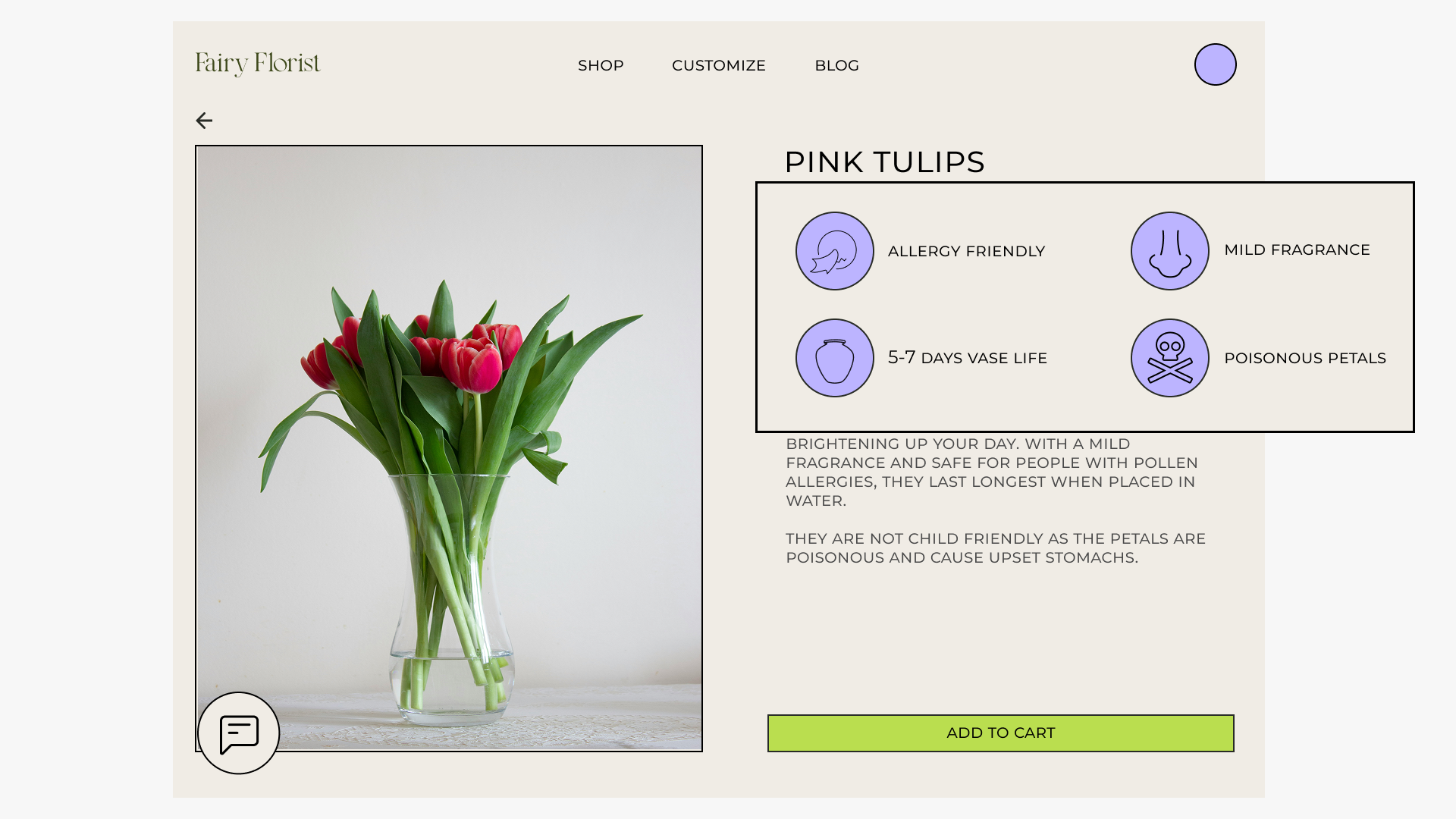
Simple Navigation Optimized for both Web and Phone
.png)
Takeaways
My main goal for this project was to create an experience that is comparable to the experience in the real world. Through user research and later reviews, I was able to create this virtual space in a way that helps users best.I learned a lot about making sense of user research and implementing it into my designs and also understood how user reviews are very impactful in this process. I also understood that I need to be careful and only include details that are necessary and keep it simple.