A Contemporary Museum Website
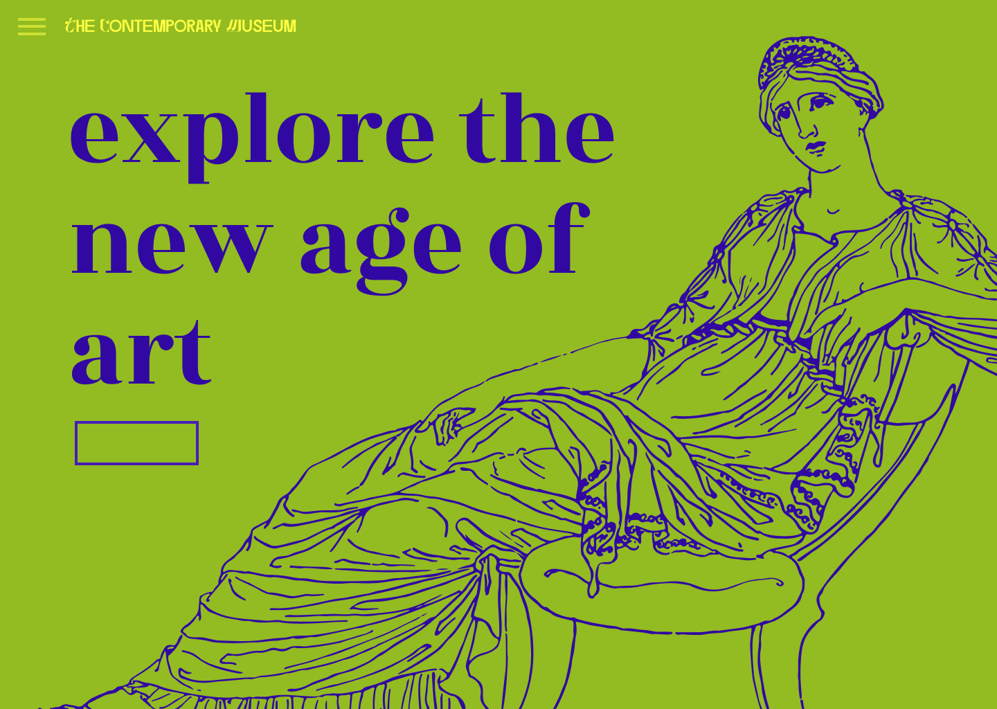
experience museums differently
Type: Personal Project
Area: Visual & UX Design
Team: Individual
Duration: 5 weeks
Concept
This is an online platform that aims to connect museum goers, students, scholars and other art & history enthusiasts not only with information about museum exhibits and events in their vicinity but also remote access to museum exhibits, libraries and archival information
Problem
People don’t always have the time to go to a plant nursery, pick out plants or flowers. Existing online stores are often difficult to navigate making it a confusing and frustrating experience. Buying plants and flowers is often a guided experience in real life and that needs to be translated in the app.
Goal
Museum websites are mostly used by people to plan their visit and check what exhibits there are but what if a museum website could be more than that and offer an alternate way of interacting with museum exhibits. Not everyone can go to these museums and not everyone who goes is able to experience these exhibits the way they want to.
User Research Summary
I conducted user interviews and created empathy maps to better understand the user’s needs. I identified the primary target group to be busy adults, who don’t have the time to go to a plant nursery to buy the plants and flowers they want.In my initial secondary research, I found the top need of users to be that they would want to be able to navigate an app with plants and flowers being easy to find through simple set of categories. In my primary research, I deduced that the topmost priority should be given to details such as care information, fragrance notes of flowers and other tips. Buying plants and flowers is a visual and olfactory experience that is often guided by a florist in a shop. There is a need to translate this into the digital space.
Pain Points

Personas
Tina is a busy artist who needs to buy flowers for her aged grandmother’s rituals and their home because her grandmother cannot go out to shops on her own.

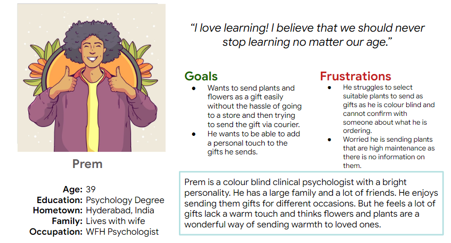
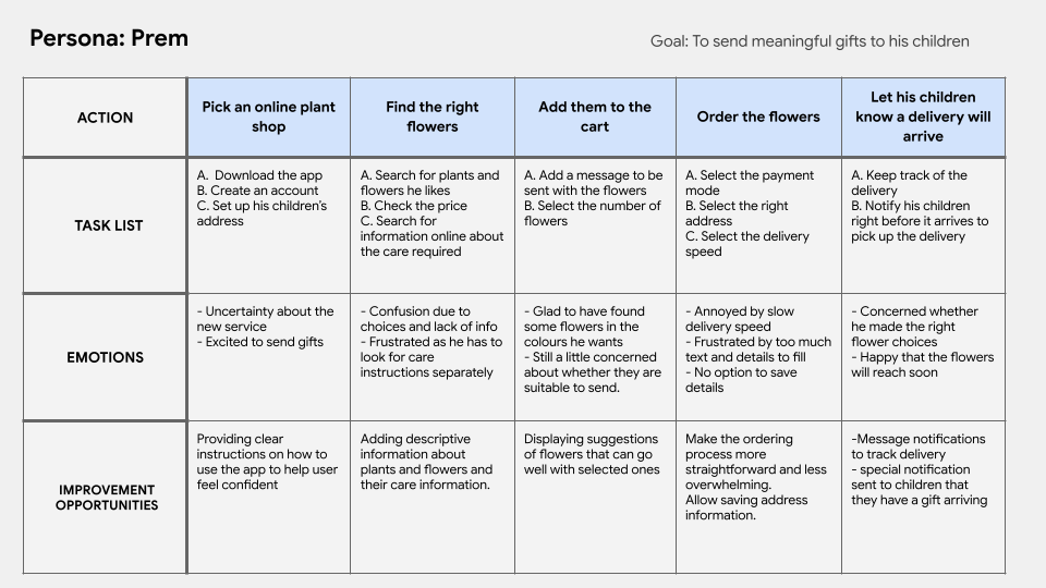
Prem is a color blind psychologist who works from home and enjoys sending gifts to his loved ones who live far away but struggles to find a service that helps him with it.
User Journey Map
Site Map
The initial iterations had a more game like approach with pretend play, cards, and board games.
.png)
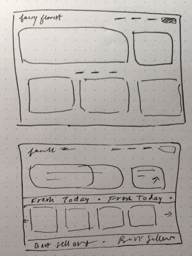
Paper Wireframes
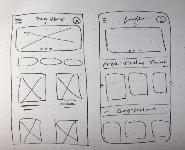
Digital Wireframes
Users expressed that they want to be able to read about the plant and it’s care info without searching online.
.png)
.png)
Low Fidelity Prototypes


Usability Study
This was an unmoderated usability test done with 4 participants, lasting about 20 minutes
Here are the key insights from the test:
1. Presentation of Information: Though there seemed to be detailed descriptions and information about the flower/plant selected, most users felt the way the information was presented was bulky and might be difficult to look at when looking at a lot of options
2. Lack of Guidance: Users felt that a feature that would allow them to contact the florist shop for guidance would be helpful.
3. Overwhelming Options: The number of images at every step was appreciated but users worried about how overwhelming it might be to see so many flowers and colours on one page. They want to be able to find what they want quickly.
1. Presentation of Information: Though there seemed to be detailed descriptions and information about the flower/plant selected, most users felt the way the information was presented was bulky and might be difficult to look at when looking at a lot of options
2. Lack of Guidance: Users felt that a feature that would allow them to contact the florist shop for guidance would be helpful.
3. Overwhelming Options: The number of images at every step was appreciated but users worried about how overwhelming it might be to see so many flowers and colours on one page. They want to be able to find what they want quickly.
Mockups
Users expressed that they want to be able to read about the plant and it’s care info without searching online.
.png)
Another main concern was the presentation of information about each flower. I simplified it by adding symbols with text that people can just glance at and understand the important details.I also added a chat feature for users that feel like they need some assistance while shopping.
.png)
.png)
.png)
High Fidelity Prototype
Website:
App:
Accessibility Considerations
1. I used consistent fonts and well spaced out visuals to help reduce visual crowding and overwhelm.
2. When choosing a color palette, I made sure my primary colors met WCAG AA Compliance before building out the UI for each screen.
3. The website has a chat feature to assist users that feel like they need some assistance in their shopping.
2. When choosing a color palette, I made sure my primary colors met WCAG AA Compliance before building out the UI for each screen.
3. The website has a chat feature to assist users that feel like they need some assistance in their shopping.
Takeaways
My main goal for this project was to create an experience that is comparable to the experience in the real world. Through user research and later reviews, I was able to create this virtual space in a way that helps users best.
I learned a lot about making sense of user research and implementing it into my designs and also understood how user reviews are very impactful in this process. I also understood that I need to be careful and only include details that are necessary and keep it simple.
I learned a lot about making sense of user research and implementing it into my designs and also understood how user reviews are very impactful in this process. I also understood that I need to be careful and only include details that are necessary and keep it simple.